A beautiful and well-designed product always attracts our eyes here are the creative rules for graphic design.
But you must be willing to know that how to design a product so as to convince the customer.
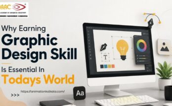
Today in this blog we will share with you details about Graphic Designing.
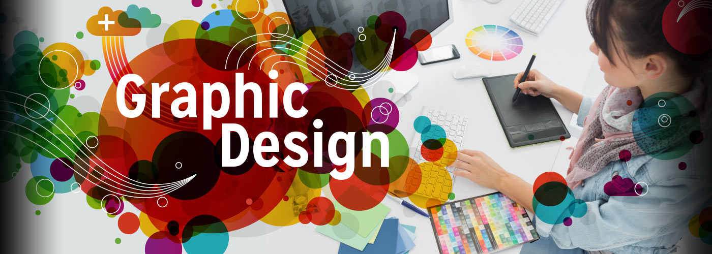
Actually Graphic Design is an art form through the combination of texts and graphics to communicate productive message in the websites, logos, brochures, posters etc.
Graphic Designer experiences with visual and textual contents.
It has a big role in brand creation and showcasing the creativity.
A graphic designer must have strong understanding of graphic design basics before approaching their work.
Elements Of Graphic Design

We know that a good design leaves more powerful impact than words therefore the designers must achieve their goals by combining some basic elements and principles of graphic design.
The elements of graphic designs are applicable for both print and web pages.
Principles Of Graphic Design

Elements of graphic design combine with principles of graphic design to form effective page compositions.
Principles of graphic design are referred to the way in which a graphic designer can assemble each element into a cohesive whole.
LINES

A line is the basic element of graphic design which can be straight, curved, dashed, thick etc.
Lines are used in every design; a thick bold thin draws attention compared to thin line.
Zig-Zagged line indicates excitement whereas straight evokes order or neatness.
They are generally used to connect two points or separate sections of a design or to focus the audience eye on certain element.
A Line guides the viewer from one element to the next.
The style of lines also matters; solid lines have different impacts than the dotted lines.
SHAPES

The basic geometrical shapes such as squares, circles or triangles can be used as boxes or borders in a graphic design.
In the above image we can see how characters are crafted with simple geometrical shapes.
Icons, dingbats or symbols can also be considered as shapes and can be added to make the design interesting.
TEXTURE

Visual Textures are added by certain graphic design techniques.
The grainy texture in the background of the above picture creates a catchy appearance to our eye.
Texture helps to draw attention to an element on a page or it can serve as a background also.
It improves the visual appearances as a whole.
COLOUR

Colours make the visual more appealing and dictate the mood of a design.
It represents the brand and tonality.
The graphic designer must have the knowledge about basic colour theory.
Each colour has something different to say.
For example red colour represents passion; blue represents security or calmness and green natural.
Bright colours evoke happiness compared to dull shades.
Colours are used for attention seeking purposes and to evoke emotions.
VALUE

The value of a graphic design represents how dark or light an area of the design looks.
If you are working on black background the value will be 1% white to 100% white.
Value is used to emphasis contrast.
A dark background with light objects draws more attention.
NEGATIVE SPACE

The “blank space” or the “white space” in graphic design is known as Negative Space.
The blank space is equally important as the space filled with colours, texts or images.
It is the area between or around the elements.
This Negative Space is widely used as it allows the human eye to read easily.
Negative Space helps to create a shape and highlights the vital elements of the design.
When used cleverly they form stunning and unique designs.
Lot of negative space in web design offers light and open feeling whereas lack of space will turn the design into cluttered one.
SIZE

The last but not the least, the size represents the importance of an object within a design; because size matters.
A large sized object or text draws more viewer attention than the small sized one.
Large or small size signals which part of the design are important.
ALIGNMENT

Alignment means placing the text or object at the top, bottom or centre of a page.
In the above picture the text ‘Keep Calm’ is aligned at the left side of the page.
It plays a vital role in creating seamless visual connection with the design elements.
Alignment makes the text or image appear in ordered manner and eliminates the messiness which occurs due to random placement of elements in a design.
REPETITION

In case of branding Repetition has an important role.
In the above picture the green logo colour of the brand Starbucks Coffee has been used repeatedly in the form of green circles.
Repetition creates rhythm in a design by binding together consistent elements such as logo or colour palette; thus making the design instantly recognizable to viewers.
By repeating logo or brand colour the principle of repetition strengthens the overall look of the design.
BALANCE

A good design has a good balance.
Balance can be achieved through symmetrical, asymmetrical or radical symmetry.
Both sides of a page layout are same in shape, lines and weight in symmetrical balance.
Symmetrical patterns look more attractive and beautiful.

In asymmetrical balance two sides of a websites are not the same but they have similar elements whereas in radical elements are placed in circular manner.
Sometimes graphic designer produces unbalanced design to focus the attention on a single element in such case the designer must have the knowledge about the art of unbalanced design.
CONTRAST

Contrast in a design occurs when two elements are in opposite to each other like white and black or thick and thin etc.
Contrast is very easy to achieve through colours, texture or size.
It highlights the important elements of a design.
PROXIMITY

Proximity in graphic design helps to create relation between similar or related elements.
These elements are not grouped together but visually connected by way of font, colour, size etc.
Proximity creates organization on a page.
All the principles of graphic design Alignment, Repetition, Balance, Contrast and Proximity are necessary to create effective design compositions on print and web pages.
Learn more about Fundamentals of Graphic Design and take out the creative you out holding the hand of the most reputed Graphic Desigining Institute in Kolkata.