
Have you imagined how the world around us would look like without colour ?
Today in this blog we will find out how Colour Conceptualization is Important in Multimedia.
Whether it is web designing, graphics, films or animation; colour is the most important part of all creative process.
Colours can impact our thinking; it can attract attention or cause irritation.
Over the years artists have applied colours to their piece of art to attract the attention and to add meanings to the artwork.
At present time Web designer or Multimedia professionals work primarily with visuals and they are constantly dealing with colours.
Professionals involved in Web Designing, Multimedia or Graphics must understand the characteristics of colours properly before their application.
In order to prepare correct colour combination for customers or websites sound knowledge on colour concept is indispensable.
COLOUR WHEEL- THE BASIC COLOUR CONCEPT
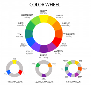
The Colour Wheel is all about Primary, Secondary and Tertiary Colours.
Red, Yellow and Blue are Primary Colours and Secondary Colours Violet, Orange and Green we get by mixing all Primary Colours. We get Tertiary Colours by the combination of Primary and Secondary colours.
Primary, Secondary and Tertiary Colours have different significance and they represent different emotions and concept about human life.
Colours are powerful enough to create ideas, ignite interest, generate emotions and communicate messages.
SAY IT WITH COLOURS
Colours speak louder than words and so they matter a lot.
Artist belonging to the field of Multimedia should use colours in proper balance, proportion, emphasis and rhythm.
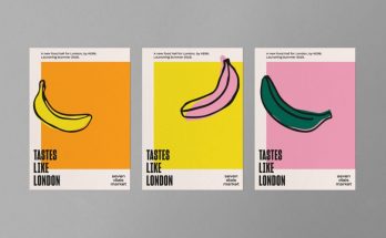
Each colour signifies certain mood and idea for example Red is for passion and power; so it is used for important notice or warnings.
Green is for growth, nature and harmony.
Blue promotes calmness and openness; therefore this colour can be used for travel or relaxation websites.
![]()
Purple is for Luxury, Romance or Fashion. Brand Cadbury utilises this colour on its product. Lighter shades of purple like Lavender signify romance.
Black is the strongest neutral colour that represents sophistication and edginess. This colour exists on almost every website. Texts in black colour represent sophistication and tidiness.
Colours must be selected for advertising or for conveying message by keeping in mind the target audiences and client’s demands.
COMPLIMENTARY AND ANALOGOUS COLOURS
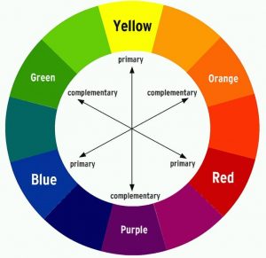
Complimentary Colours complement each other and located opposite to each other on the Colour Wheel such as Blue and Orange, Red and Green, Purple and Yellow etc.

Very common Mozilla Firefox Web Browser Logo has Complimentary colours. Both blue and orange takes up half the Logo; here blue represents the World and orange fox shows that it bonding the world together.
Similarly you can find many brand logos using complimentary colours to give a contrast effect. But complimentary colour must not be used on top of one another for text on the website.
Whereas Analogous Colours are situated right next to each other on the Colour Wheel for example Orange and Yellow or Blue and Purple; and they generally match fairly well but give little contrast effect when used together.

Analogous colours create more soothing look compared to complimentary colours.
In nature and landscape one can find analogous colours more often which can be captured by digital camera and with little colour adjustment visually dynamic images is guaranteed.
Therefore basic knowledge about colours is important for the Web designing or Multimedia artists so that they can choose the right colour for the right purpose.
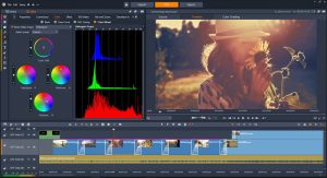
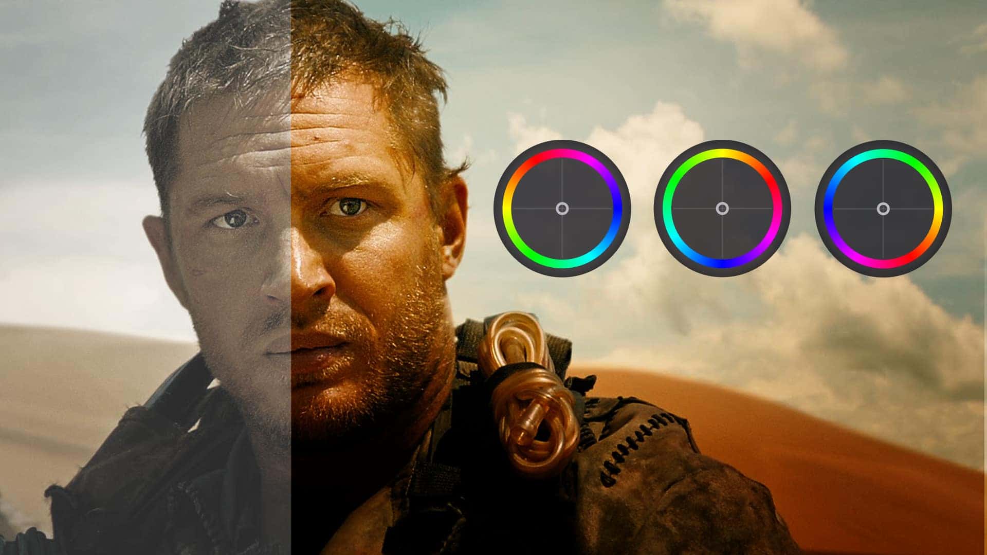
When an artist opens an image on the multimedia platform with the help of software; the artist can easily perform Colour Correction Methods on the image with the help of Colour Wheel Option available in the tool box.
Colour Wheel is now the most common feature available in almost all multimedia software so that artist can work on colours desirably.
ASPECTS OF COLOURS
Hue, Saturation, Lightness, Value and Temperature
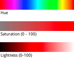
Hue is the actual colour itself in the colour wheel whereas Saturation is all about intensity or purity of the colour in the colour wheel.
An image with 100% Saturated hue means there is no addition of grey to the hue; the colour is absolutely pure. Such hue or colour appears brighter; whereas hue with 0 % saturation looks like medium grey.
Lightness is about degree of black or white added with a given hue; adding white makes the colour lighter and adding black makes the colour darker.
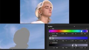
VFX artist or Web designer can work on Hue, Saturation and Lightness of the colour by importing the image in any computer graphic programme.
Colour adjustments helps to create more stunning visuals.

It is the switch in Value which enables a person to see object as three-dimensional. Object with contrasting Value of colour appears to be more prominent.
In the above image the sphere on the left has solid colour and appears flat. The lighter and darker shade of the sphere in the middle gives it a dimension. The image at the right appears to be perfectly three-dimensional with lighter and darker shades of colour.
Value directs viewer’s attention and emphasises a particular area or object in a composition.
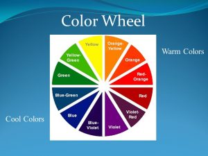
On Colour Wheel some colours comes under Warm Colours and other under Cool Colours.
Warm Colours like Red, Yellow and Orange remind us of Sun or Fire and evokes the feeling of warmth whereas Cool Colours like Blue, Green remind us of water and grass. This quality of colour with regard of Temperature is universally accepted.
Temperature of an image can be increased by increasing Orange level because orange colour makes the image warmer and happier just like the sun rays that make the world happy and glowing.
In an image composition warm colours must be used in foreground and cool colours in background.

This beautiful image shows both warm and cool colours in one frame. Sandy area with Red colour shows warm colour and blue water shows cool colour.
Picking up the right colour for the right purpose is quite tricky and that’s why artist should consider all the factors related to colour concept before choosing the right one.
MAAC’s Graphic Designing and Multimedia Course provide a detailed knowledge about Colour Conceptualization.
So what are you waiting for enroll at MAAC Institute and be a part of a digital colourful world.
Call us 9836321595 to know more.
